Daily press, Trade press, 2015-11-20, 01:31 pm
New thyssenkrupp branding: Blue logo shines over Duisburg

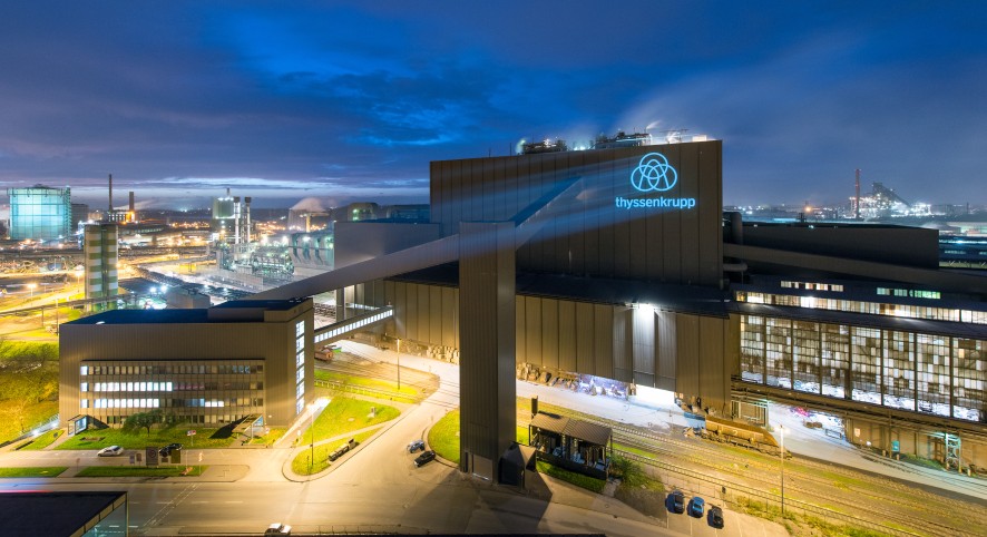
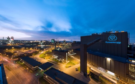
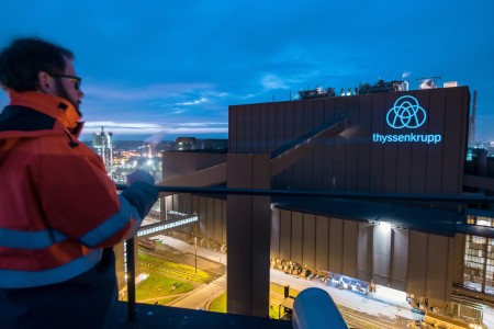
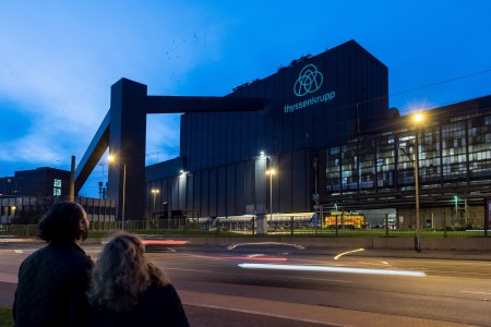
thyssenkrupp’s new brand identity is visible from afar: Even drivers passing through the north of Duisburg on the A 42 and A 59 highways can see the new blue logo, positioned prominently on the outer wall of meltshop 1 on Kaiser-Wilhelm-Strasse, directly opposite the headquarters building of thyssenkrupp Steel. As soon as it becomes dark, a more than 15 meter-tall image of thyssenkrupp’s new logo is projected onto the facade. In this way thyssenkrupp Steel is supporting the Group’s rebranding and making it visible to employees and local residents. The new logo will be shining over Duisburg for the next three to four months to make it familiar to everyone there.
The new brand puts a stronger focus on customers and makes thyssenkrupp’s transformation visible. It will be a strong common brand for all thyssenkrupp companies worldwide and creates a uniform and positive image among customers and employees. This is underpinned by the new way of writing the company name and the new design and colors of the logo. In the future thyssenkrupp will be written as one word in lower case letters. The Thyssen and Krupp signets, previously separate, now form a single element. The new brand deliberately represents an evolution. The Group wants to carry its good traditions forward into the future. Overall the brand is now fresher, more contemporary and modern – and thus an expression of thyssenkrupp’s transformation.


